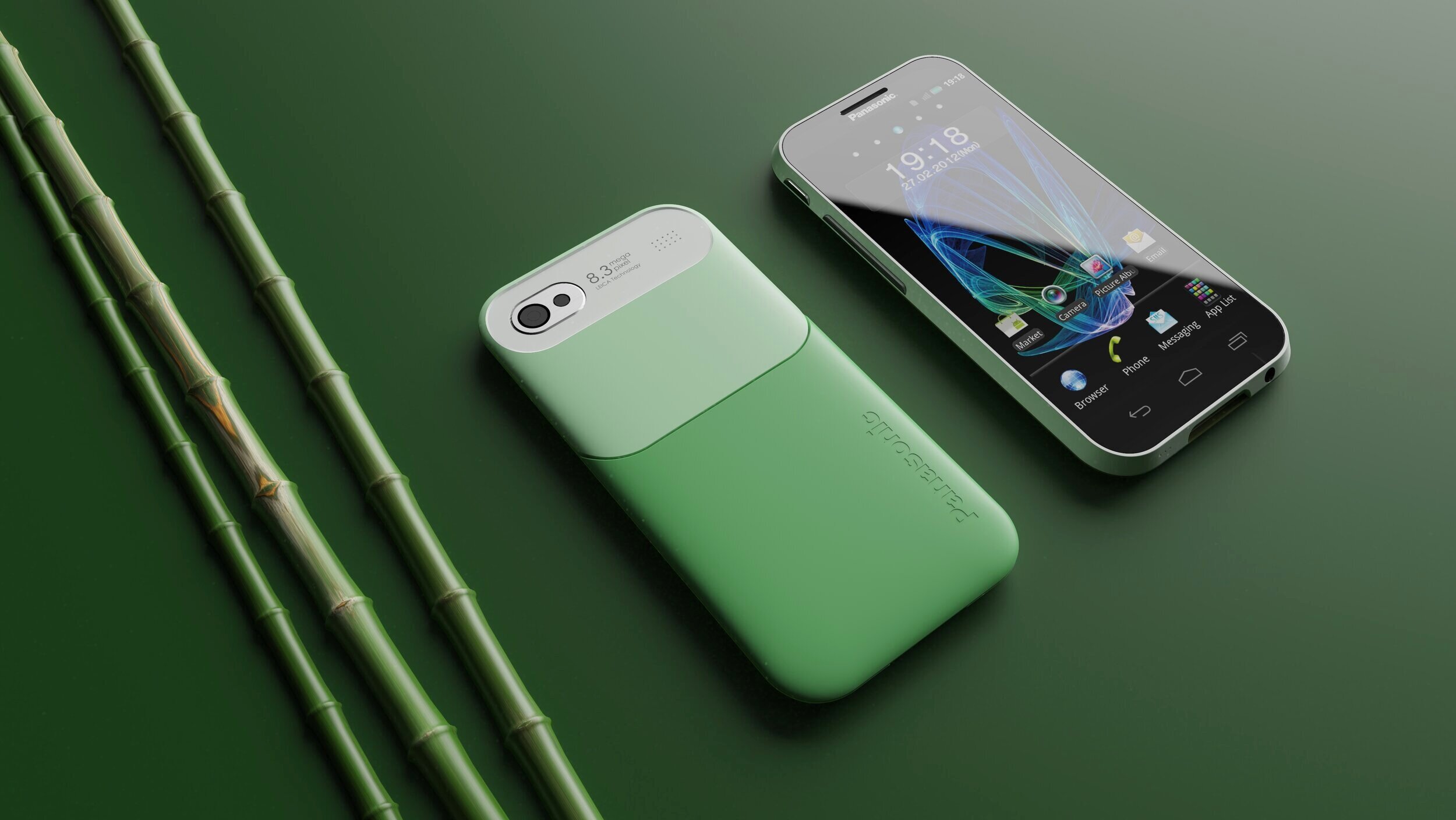
Panasonic Mobile wanted memorable phones.
Panasonic Mobile division asked PSVL (Panasonic Silicon Valley Labs) to explore design themes for their tier 2 smartphone line.
I led the exploration and themes of this project.
The challenge
Boring
Panasonic is known for their wide range of quality products. However some may say that their products do not have emotional connection to users.
Stiff competition
With the iPhone and Galaxy out in the market (tier 1), this posed a challenge entering the market.
All look the same
The competitors all looked the same. Panasonic requested that the designs needed to be conservative. However we felt this was an opportunity to be different.
Final theme

Celebrating icons of Japan
Themes presented

竹 - Ta-ke - bamboo

矢 - Ya - arrow


